
Redesign Project
From Shell to Shelf
The Just Egg landing page redesign for simplified product discovery.


The Current Experience
Just Egg manufactures and sells eggs and egg-derived products with a twist: these eggs are made entirely from plants! 🌱
Their website is not an e-commerce platform but an informational hub where users can explore benefits, discover recipes, and find online or physical stores that carry their products.
Problem Discovery
Most users navigating to this site are here to learn about the products and, ultimately, where to find them. But to accomplish this, they face some setbacks.
From Scrambled to Simple
❌ Current Challenges
Poor Readability: Busy images hinder text legibility, affecting engagement.
Confusing Navigation and Excessive Scrolling: Titles lack clarity, the layout expects for the user to click multiple ambiguous titles and navigate between pages to find key information buried away under more scrolling.
Unclear Purpose: The current layout does not effectively convey what the product is, why it matters, or where it can be purchased.
✅ Proposed Changes
Emotional Imagery: The heart-shaped dish reinforces warmth and a connection to the brand's values.
Trust signals: The use of benefits with icons (e.g., "No Cholesterol," "Plant-Based") immediately reassures users.
Impactful tagline: The original says 'Really good eggs', which is effective but generic. Here I took the opportunity to make a bolder statement: 'Good eggs come from plants' reinforcing the brand's identity and mission.
ChatBot: Chat feature to add instant connection and resolve questions immediately.
Clear CTAs: Direct users to key action without the need of scrolling.
Extra: Enhanced contrast over images to improve readability.
✨ Benefits:
Key information is surfaced early, reducing the number of clicks needed to explore the product.
Users instantly understand the product, its purpose and how to obtain it - no scrolling required.
Product Discovery
❌ Current Challenges

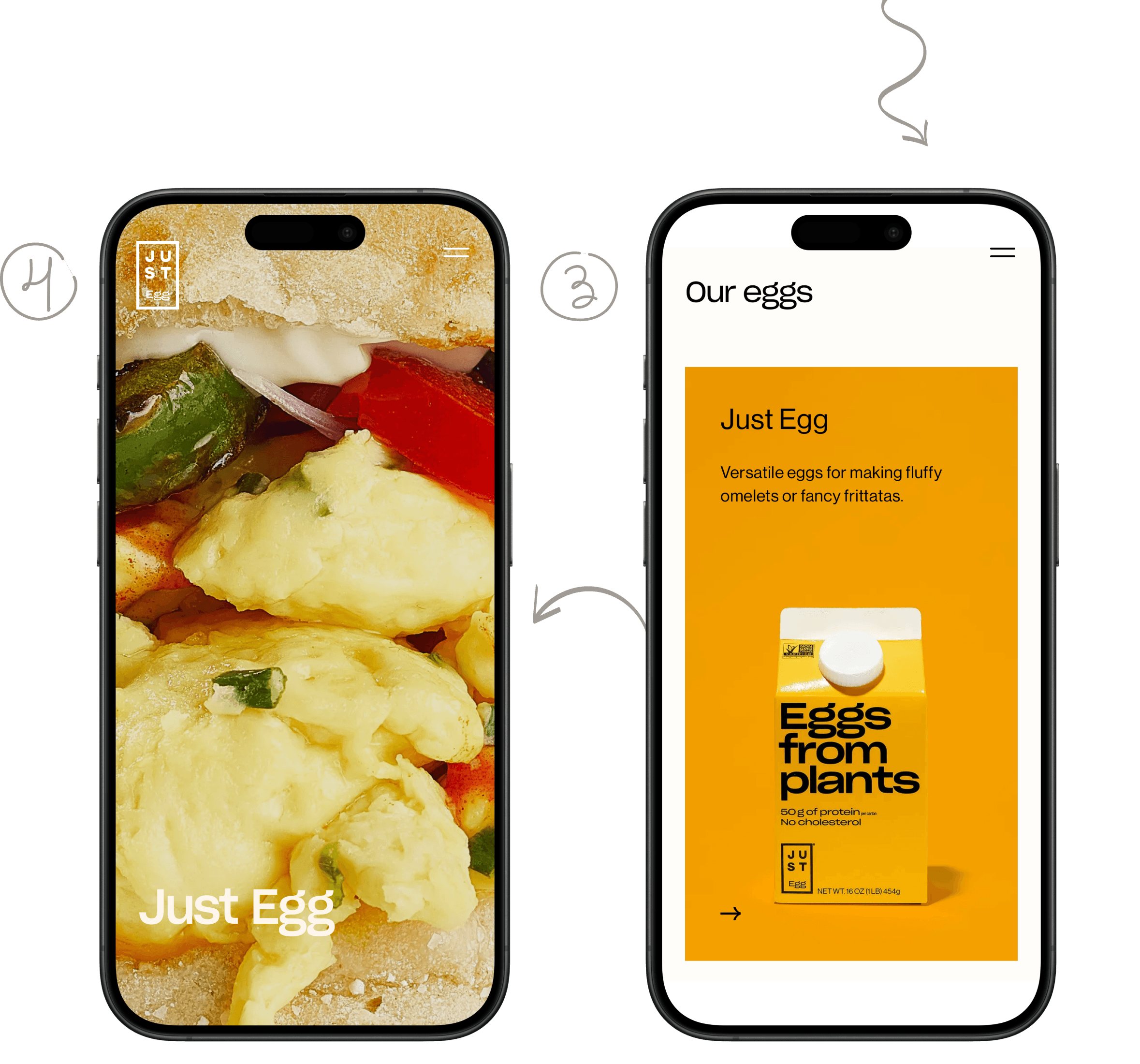
To reach the products, users must:
Click on one of the landing page covers that serve as entry points to different categories (egg-like products, mayos and dressings).
Once on the category page, scroll extensively to locate the products.
With minimal information on the product cards, users must click again to learn more.
Finally, they reach the product detail page, but even there, further scrolling is required to gather all the details.
✅ Proposed Changes

Features
✨ Benefits:
Simplifies browsing, eliminates page-hopping, and improves users comprehension.
Other Enhancements


Interest Articles
Section that combines scattered content (health benefits, sustainability efforts) into a cohesive area.
2 . & 3. Trust Elements
The site counts with celebrity-endorsed recipes, these are now visible on the landing page adding credibility and aspirational value.
Access to customer reviews. As 77% of online users are likely to read reviews to inform their purchase decisions, reviews serve as a powerful and free marketing tool that companies can effectively use to their advantage.
+ Story Telling
The entire flow now narrates a compelling story: what the brand stands for, their mission, and why the user might find it appealing together with a sense of social camaraderie all on the main page.
We've Converted!

Redesign Impact
Redesigning Just Egg's landing page is my way of making a brand I admire more accessible and user-friendly, supporting its mission to make plant-based eggs appealing and available to everyone! 🌱🥚